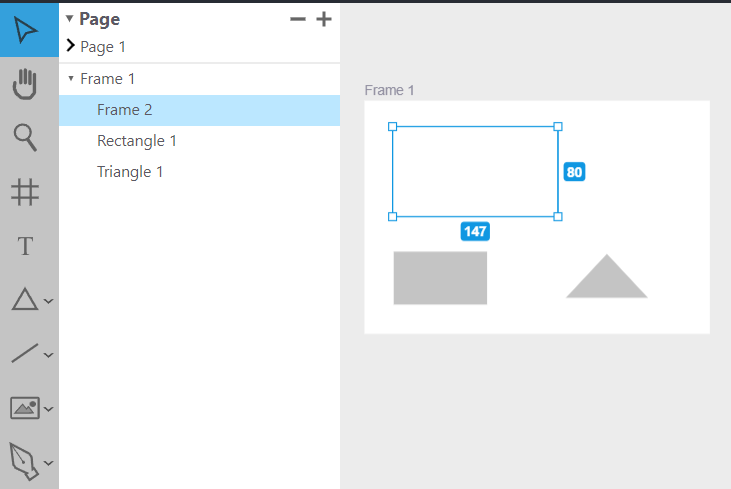
The toolbar has icons that allow different modes to be selected. Some of those modes are select, pan, zoom, draw frame, create text, draw shape, draw line or connection, image component creation, and more. The currently selected tool shows up with blue highlights. Some of the tools are actually a group of tools where the individual tool can be selected, by selected by clicking on the chevron icon to the right of the main icon to select from a list of icons. I created all the icons.in the design tool Website.

The left section of the page includes the ability to add, delete, rename and select individual pages. Pages are different layers to the project that can be selected. When one layer is selected, the other layers aren't shown on the canvas. Pages can also be renamed. The current page is shown by a carrot to the left of the page. The pages list can also be collapsed. If the page list is collapsed we can open and rename the current page simultaneously by double-clicking on the header text.
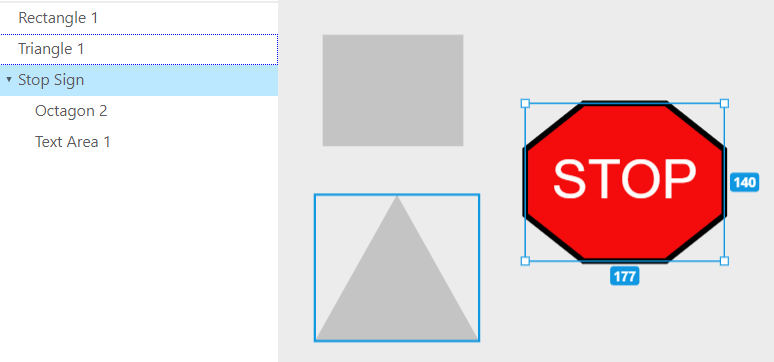
Below the pages are a hierarchical list of objects on the page. Each of the objects can be renamed here by double-clicking the name of the object, typing the name in the text box that appears in its place and then pressing enter to save the name and make the text box go away. We can also expand or contract the container objects. Selected objects have a light blue background and objects in the highlighting hover shows up as a dotted, light purple frame.
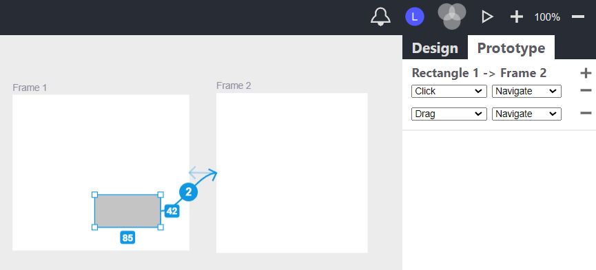
Create interactions between visual items and frames or frames and frames. There can be multiple interactions between frames. If there is more than one interaction the number of interactions is displayed in the center of the interaction line. Interaction lines have an arrow on the end that points to the end place of the interaction. They can be selected or deselected, but they only show up when the prototyping tab is active. Each action has multiple behaviors that can be customized.. The behaviors will have different meaning when we run the prototype.
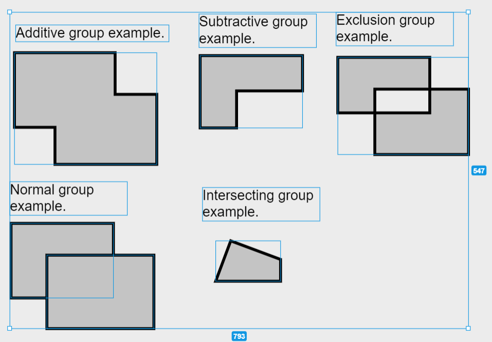
Create standard, additive, subtractive, intersecting, exclusion, or union groups.by selecting the items you want grouped, then clicking on one of the add to group icons. Groups are hierarchical in nature and enable the scaling of items in the group by changing the height or width of the group. Change the z-order of overlapping items by choosing bring to front or send to back on the right click menu.
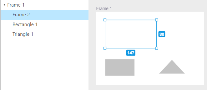
Frames are used to group content that should be displayed together on a screen. When a group is moved or sized, the content in it moves or sized with it. Level 1 groups show a name near the upper left of the group that can be clicked and dragged to select or move the frame. The background color (fill) of frames can be changed (including creating a gradient). Level 2+ frames can be added by adding a group within another group. These frames don't have a name and selecting them differs. Frames really shine in prototyping mode.
Zoom in or out, pan, and select. There are zooming buttons with the percentage zoom displayed in the upper left. There is also a zooming tool that allows us to zoom in on a selection to fill the screen.
Most actions can be undone or redone by pressing ctrl-z or shift ctrl-z on the keyboard. There is a tasks object that keeps track of the undo and the redo stack of tasks. When a task (like moving or changing attributes) is performed, the relevant state is information is saved to a task object on the undo stack. If we undo,, the state information on the undo object is used to restore the site to the state it was in beforehand and the task is removed from the undo stack and moved to the top of the redo stack. The redo is similar to the undo.

When we save, we save the current state in a series of hierarchical objects. The hierarchy is shown above in a graphic I made with the tool we are showcasing. Each of the objects is created and linked together using the state of the tool relevant for that object. The entire tree of objects is then serialized into one big string of text. When we want to load, the current state of the program is replaced by deserializing the string of text used to save, then re-creating the archive objects. The archive object hierarchy is then used to restore the state of the Website.

We can export a visual item by selecting it and then clicking one of the export options. Currently we can export in .svg or .png format. To export multiple items at once the items must be grouped. We can then import them into another program like Figma. By selecting item(s) and typing ctrl-c (copy) and then ctrl-v (paste) we can copy an item or group of items to and from the clipboard. Currently, this only works within the site.
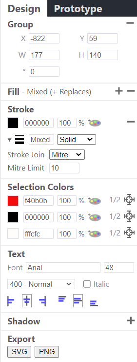
The above image shows just some of the features of the design mode I show relevant sections to the visual items being selected on the canvas in design mode in the right section of the page, . These sections include the item alignment toolbar in which I align items relative to each other. I also have the item dimensions, fill, stroke, line, text, image, shadow, export, and the selected colors sections.
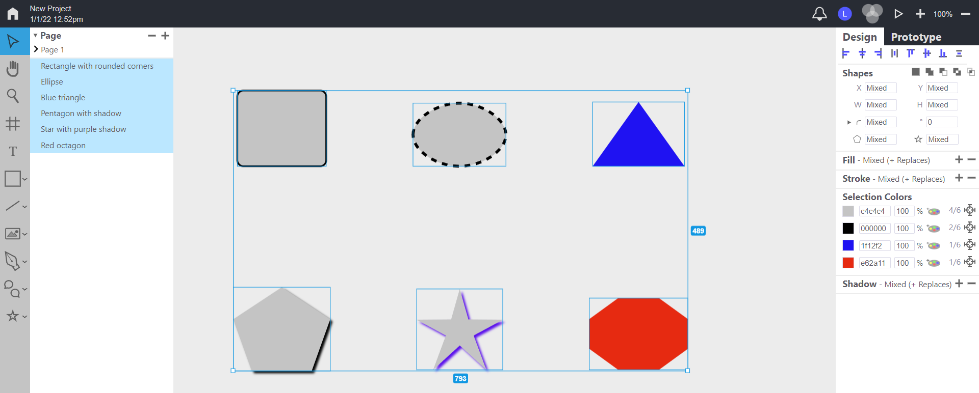
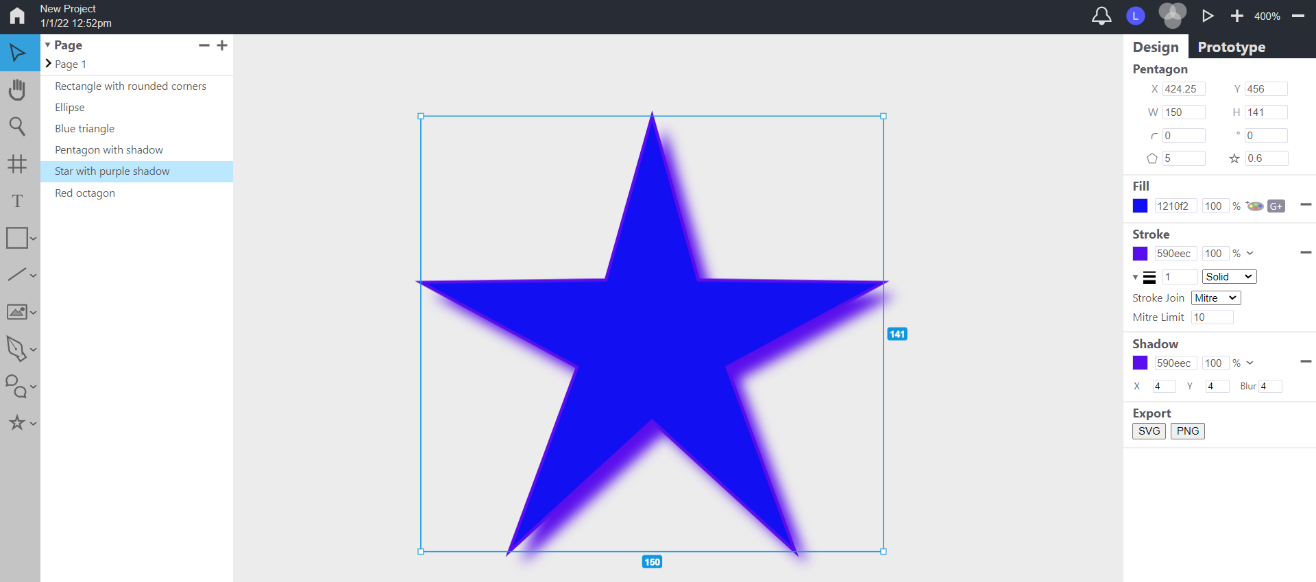
Create various shapes with different names, number of sides, X and Y coordinates, width and height, rotation and rounded corners.. The stroke can be of different colors, widths, solid or dashed (customizable), with stroke join and mitre limit as advanced options. There is also a star ratio that allows star-like shapes. The shapes can be manipulated either by clicking/dragging on the canvas or edited on rthe right with text fields.
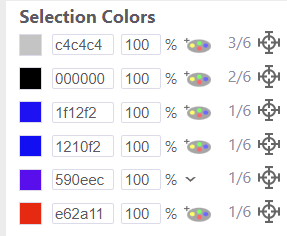
Create sophisticated gradients for the fill of shapes, pen drawings or frames. Clicking on the add to gradient icon adds the gradient to the preferred color palette that appears on the color picker. When there are at least two colors in the gradient, it becomes active (shows up on the canvas) Gradients can also have a stop position for each color and relative starting and ending positions. The gradient can be linear or radial.
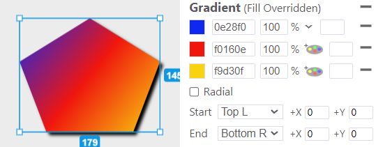
Create sophisticated gradients for the fill of shapes, pen drawings or frames. Clicking on the add to gradient icon adds the gradient to the preferred color palette that appears on the color picker. When there are at least two colors in the gradient, it becomes active (shows up on the canvas) Gradients can also have a stop position for each color and relative starting and ending positions. The gradient can be linear or radial.
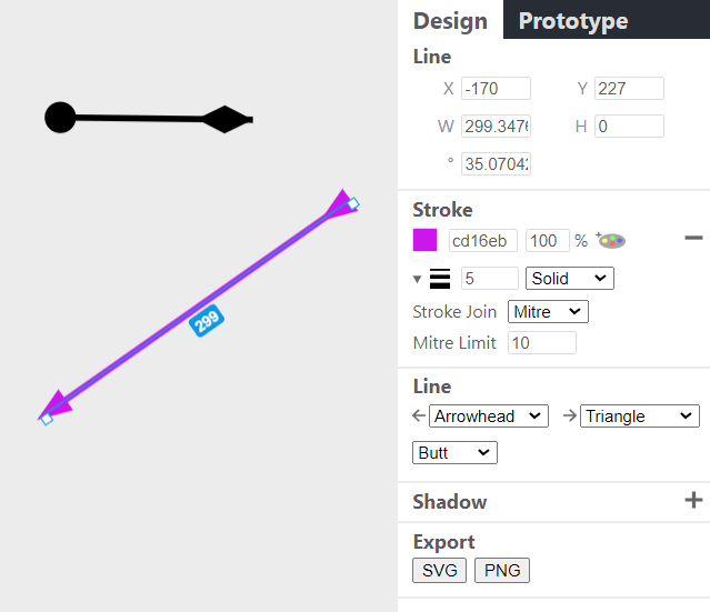
Lines can have different graphics for each end including line (arrow), crow's feet, arrowhead, triangle, circle and diamond. We can change the line width, color, and line ends type (butt, round, or square). Lines, unlike connections don't need to be attached to other shapes. The graphics on the ends of the line scale with the width of the line.
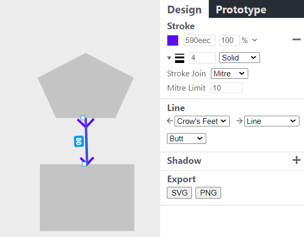
Connections are lines that can be connected to the side of a shape by selecting the connection tool and then clicking on a socket (temporary circle) that appears when we hover over center of the shape's side and then drag the line to another socket on a different shape. The connection will then connect those locations even if the shapes change. (e.g.in location). Connections can be reconnected by clicking and dragging the line end to a new socket.

We can create text items by selecting the text tool and clicking and dragging a text area rectangle. We start out in text insertion mode where we can type some text. When we are done we click outside the text and the text becomes a visual item. We can then change the font with a wide selection of fonts, The text size and relative alignment can also be changed. We can even rotate the text, add a shadow, change its color, change the font weight, or make it italic.

We can use images by creating an image rectangle and typing the image id. We can also rotate or align images within the image rectangle. Currently, we only have the ability to select images that are already loaded on our site. The ability to load images is a to do item.
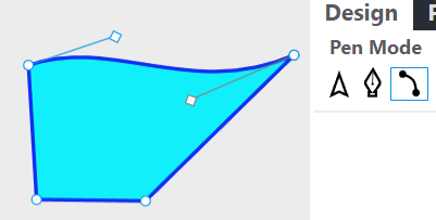
The above image shows making curves in the curve pen mode. We can create pen drawings by selecting the tool to enter pen drawing mode. There are three different sub-modes when we are in pen-drawing mode - select, draw, and curve modes. In the draw (starting) mode we can click the canvas to create points that have lines between them. Right-click to undo the floating point and start a new series of points and lines. The select mode allows us to select and delete points. In the curve mode we can click on existing lines or points to add curve handles that can then be moved, selected or deleted. We can also change the color of the lines or fill. We can't add more than one fill color for technical reasons, but we can create multiple pen drawings and overlap them to achieve the same effect.
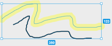
The above image shows lines drawn and selected. The drawing and the highlighter tools were used for this. For both tools, we can change the line width and color. We can also make the line drawings dashed. The highlighter tool adds highlighter colors to the color palette when a highlighted line is selected. The pencil drawing tool defaults to a 3 pixel wide black line and the highlighter tool defaults to a 24 pixel wide yellow stroke with a 35% alpha value (it is 65% transparent).